Thursday, September 30, 2010

Time has NOT Dragged On

I thought I'd post a couple of photos of  projects with a dragon theme today.  When I looked through my photos, I realized that it is already nearly nine years since I painted the key and box for my eldest son's 21st birthday - in fact he and his wife are planning his "Big 3Oh" already for Feb 2011, so as I said in the title of this post time has NOT dragged on (drag-on get it?) Oh stop groaning, you love the corny puns really ;)
The card was also for my eldest son's birthday, but this year.  I figured he used to like dragons, so......  I cut his name using my Silhouette and welded the letters together before cutting them as one word.  The paper I used is that sort of rice paper that you get, which is lovely to look at but not that easy to work with, especially in this sort of application; once you added the glue to the back it was like working with fairy floss! I learned from it though, and will use attractive sturdy paper next time!  I used the same principle for his name on the envelope, but as I had used a chunkier font didn't have the same level of difficulty working with it.  The image is a sticker, as is the sentiment.

This box is called "Dragon Ladies" and was painted from a pattern by fellow Australian Donna Gilbertson.  I have painted quite a few projects using this very talented ladies' patterns, go and have a look at her site and you'll see the appeal! I painted this box for my sister as a Christmas gift a few years ago, she loves it as it ticks all the boxes as it were: it is purple, it is cute, it has dragons on it and is whimsy!


 The last project for today is that mentioned in the intro!  I designed both these pieces myself, even cut the key out using my trusty jig saw.  I used a (tiny) picture of a blue dragon I saw years ago on the web somewhere, I think it was on a site called "Dragons Be There" or something similar, on the box and an equally tiny black and white drawing of the yin/yang dragon for the key. The back of the key was painted flat white so all the party guests could sign it as a memento, then sealed. I used the black because Matt had always wanted a black room (don't they all) and black curtains and accessories was the closest he got; I thought the red and gold gave the pieces a touch of class!

All the paints for these projects are from Jo Sonja, the sealer on Matt's gifts was Automotive Sealer, which gave a level of gloss that I liked but proves impossible to photograph without reflections causing problems. 


Thanks for looking, hope your day doesn't drag-on and that you'll be back to see some more of my scorching stuff  (Sorry, couldn't help myself)


Saturday, September 25, 2010

Baby, It's a Jungle Out There

This little card was done in response to the challenge at Totally Gorjuss "Wild Thing", to have an image of an animal on your project.  There are certainly animals on this card, but just how "wild" they are.....hmm.
The giraffe is a puffy sticker that I got in a discount store, it is quite sparkly and kind of overweight for a giraffe, I thought!!  The card is white cardstock, the mat is from the DCWV Bright mat stack and the designer paper - I made myself  ta-da!!!!!

I got the images from a digikit by Bev Luedecke called Jungle Babies, they were "normal" sized so (using Microsoft Word) I resized them down to about 1.5cm and made several copies of each.  I then flipped and rotated them scattering them all over the page, finally I grouped them all together and inserted them as one image in to a new document,leaving enough room at the top for the sentiment.  It really didn't take much skill or long at all - now I'm hooked and I'll never be short of matching paper again; try it you'll be amazed how easy it is to do.

I did some faux stitching around the edges of each layer with gel pen, added some different coloured brads at the corners and rubbed on the "it's a baby boy" sentiment.  It is only a simple little card, but I did acquire a new skill making it so I am happy.

Here is a close up of the paper I "made", what are you waiting for go and 'avago (as we say in Australia) yourself

Thursday, September 23, 2010

Time to say "Happy Father's Day"

Well actually the time has come and gone to say "Happy Father's Day" - it was a few weeks ago!  I have just got around to posting pictures of this card, that I did for my dad.
The image came from a sheet I bought some time ago, it doesn't have a name on it, so I have no idea who the manufacturer is, but it is a great sheet: It has several images involving time (watches, grandfather clocks etc) in this vintage style that seems so suitable for mens' cards.  The tag was from the sheet too, one of several. I found the sheet in my stash when I went to put away the NEW sheet I bought (a really great Graphic 45 sheet) to make dad's card - it was a cross between  'oh dear' and 'it feels like Christmas' finding it - I'm sure you know what I mean, lol.

The circle embellishment is  from Kaisercrafts Le Chateau 6x6 collection, as is the polka dot paper (the dots are shiny). These little collections are really good, having some plain prints (is that a contradiction in terms?)  and some "feature" sheets like embossing, flocking, glitter or foil. 
I matted the image up on some black Leathercraft card and threaded some gold ricrac cord through the tag, the letters are stickers - the coppery gold colour is a really good match for the gold cord.  Dad really liked it - I hope you do too.
It was a bit more elaborate than the one I did for my darling hubby - but he's not my dad, so technically it was a sort of "bonus" card: He loves pigs so I did this little five-minute job with some bits left over from my dad's card and some scraps (it is only about 8cm or 3" square). I embossed the gold filler board with Swiss Dots Cuttlebug folder and popped the little piggy on foam dots. Hubby got the joke.

Wednesday, September 22, 2010

Posting Comments

It has been brought to my attention, (thanks Risa) that there are some problems leaving comments after my posts.  I've written a post on how to easily solve this and put it in my sidebar so that the info will stay there.  Please persevere, I'd love to hear from you.  Now as I have spent HOURS fixing this up, including getting a dedicated email address to leave in my Contact Me page (how desperate am I?) I really will have to go and do some work!!  I mean genuine work, you know the type that makes you money hehe, I'll be back later to do another post as I "found" some photos of my Dad's Fathers Day card that I want to put up, "see you" then, Dee

Bird, Butterfly and Buttons


 This card was made for the Flutter By Wednesday 's Weekly Challenge, the theme this week is "use buttons", as always with Flutterby there has to be an angel, fairy or butterfly on the card.  I have used a sketch from Sketch and Stash who's theme is always to use something new from your stash on your card: In this case it is the ribbon, which I got in the Craft Show in Perth (I got loads of different ribbons, half a metre of each, it took the guy ages to measure it all up and I spent about $15 - last of the big spenders, me!) and the buttons which I bought in a big bag from Spotlight.
There are all sorts of novelty buttons in these packs and they come in different themes - these are in the Pastel Collection, this is the darkest one in the pack. They are great value (not surprising for me, is it?)  I have used the Teeny buttons from the same range before, but never these, I'm going back to get some of their Christmas themed buttons, the trouble is when I go, my bargain turns disastrous as I buy all sorts of other stuff while I'm there!


The image is from some Christina Rea paper my son got me from Starfish Lane for Mothers Day, I used a bit of it on my mums birthday card and cut (and embossed) this piece out of what was left with my Spellbinders Nestabilities Labels 4 die, I've still got some very usable bits of the paper left - not bad from one piece of A4 paper!  I used the Nestie to cut and emboss the mat as well from Die Cuts With a View self adhesive mat stack Neutral collection.  The plain blue paper is from my stash as is the pearlised cream mat that the whole thing sits on (the patterned pp, also part of my Mothers Day gift from Starfish Lane has a gold sheen to it that just doesn't show in photos)


I put three flat backed pearls on the bottom right hand side of the card to balance the three buttons down the left: I got these pearls from the same (patient) fella at the Craft Show in a sort of "pick and mix" arrangement that was really reminiscent of buying mixed lollies when I was a kid, lol.

Tuesday, September 21, 2010

Dragon or Dinosaur Egg??

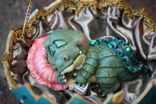
Thought I would post a few pictures of an egg I did for my sister a few years ago - she loves all things fantastical so I get my fix of wizards and witches, dragons and fairies, butterflies and whimsy by making gifts for Fi! 
 The egg is an ostrich egg, I cut it in half horizontally in a zigzag.  I then cut the top in half in a zigzag, the pictures speak for themselves really.  I painted the outside in a teal colour and then a coat of Duncan Pearl Acrylic.  Inside is lined with a stretch metallic type fabric: my sons were in the ballroom dancing circuit at the time and I had access to scraps of all kinds of fabrics, I still use some of the bits of lace and trim I got from their partners!


Dina the dragon baby (what else do you expect to find in an egg!) was a cheap ornament I found in a discount store, I painted her up and added a  bit of bling.  How cute is she?!  


I really love her little baby bottle, she has green Swarowski crystals along her spine and two tiny red ones in her nostrils.  


I'll post some more of these mystical themed projects soon, it seems appropriate coming up to Halloween!

Hope you enjoyed meeting Dina, see you soon - until then time will just drag-on (I can hear you groan from here!) Dee


Monday, September 20, 2010

Gift Card Wallet

The other day I posted instructions on how to make a gift card/money holder in my "Tutorials, Templates and Other Freebies" page (see the link under Pages in the sidebar) and realized I had never done a blog post on it.  Well here it is!

This wallet style is really good for the men in your life, this one was for my son Chris - hence the "C" on the closer.  I used Die Cuts With a View "La Creme" collection paper which is quite thick and I used two layers to give different patterns inside and out; you can use double sided paper but the end result is a bit flimsy. The "C" is a gold sticker. I trimmed the edge with plain black, which covered the raw edges.
I hope the template and instructions are easy to follow, if you have any problems post a comment and I'll try to solve it.  I'll put my template and instructions up for the gift purses I have done for the ladies here and here soon.  In the meantime get walleting.

Friday, September 17, 2010

Trick or Treat? that is the question


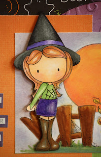
 This is "Witchy Emma" by CC Designs, yes AGAIN with the CC Designs - anybody would think I LOVE these images! The background image is one of theirs as well it is the Swiss Pixies Halloween Scene. 
ATSSketchEmma is entering a competition at All That Scraps, using this sketch.  I have stuck pretty much to it except I have used two embellishments at the bottom right being the eyeballs of Emma's little friend,  Two Peas in a Bucket also have a challenge on, "make a Halloween card", so this card is "going" there too.
The card itself is purple, from DCWV Jewel stack. The great Halloween paper is called "Oogie Boogie", isn't that cute?  I don't know the manufacturer, I was so busy cutting it up I didn't take note.  The green strip is DCWV self adhesive    card from their Brights mat stack and the orange paper is from Kaisercrafts Hippy Girl collection.  

 I coloured the background for the image with sponge daubers using Antique Blue and Aubergine pigment inks.  The moon I coloured with an orange marker then highlighted with yellow marker then yellow pigment ink; Emma's skin,the fence and leaves with Copics, the rest with markers.  I "fussy cut" (just heard that term and HAD to use it) Emma and popped her up on foam dots.
D'vine Swirls Cuttlebug embossing folder gave a bit of texture to the circle behind the main image.  I like the way the shape of the circle and the moon "reflect" each other; in fact when I saw the sketch I knew I just had to use this image which I haven't used until now!
The sentiment, which I just realised doesn't have a question mark, is made up from  "Tiny Letters" stickers on a few strips of leftovers from the card itself; what I have discovered - after much cursing - is that it is best to NOT try and line up these little letters, just let them go a bit "au naturel".
Emma's little friend's (or is that fiend's? haha) eyeballs have been in one of my crafting cupboards for YEARS, lucky I could find them.  Thanks for looking, hope you like "Witchy Emma", I sure do and will be making more Halloween cards and  also birthday etc cards with the "Witching you a......" type sentiment. Until then, remember I'll be "witching" you - oh, does the wit never end........


Wednesday, September 15, 2010

I'll mark your place


This cute idea is from All That Scraps Wednesday challenge "make a corner bookmark" http://atsblog.typepad.com/wednesdayschallenge/. There is a link to a tutorial there (from Splitcoast Stampers) and some great design team ideas. I've done mine in autumn colours to fit in with the Allsorts Challenge theme "autumn colours"  (http://allsortschallenge.blogspot.com/) .  
I used a pumpkin coloured cardstock, the edge of the mat is punched with an EK Success Scroll & Hearts border punch.  The beautiful paper is from Basic Grey's Indian Summer 6" paper pack and the gold ribbon is from my stash - well it was in my friend s stash until she gave me it, along with a whole load more the other day, thanks Jenny!

The image is yet another CC Designs stamp (from All That Scraps), this is Larkspur, one of the "Twisted Sisters" in the Sweet November range. I saw these images first at Tickled Pink Stamps and was lucky that they have been re-released as digistamps - my preferred medium. I coloured her with Copics (skin and hair) and pigment inks from Kaisercraft for the rest.
Don't you think these little bookmarks are a great idea? - and if you use simple embellishments they are pretty quick to do.  I'm going to make a bunch of them as "stocking fillers", my dad reads a lot so I can probably make him more than one!
Go and have a look at some of the ideas and get bookmarkmaking!!  
Thanks for looking, Donna

Tuesday, September 14, 2010

Sunflower Emma Says Thanks

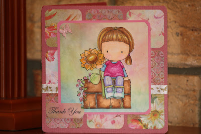
Todays offering is a card I did for my mum to give to her neighbour by way of thanks for some of the little things she does for her and my dad; in this instance she had brought over a beautiful 2 course meal for them - and she is a GREAT cook!  I hope this lovely neighbour liked her thank you card .
I used Dusty Pink cardstock, the patterned paper is from a new 6" pack I bought (yes, another one; like I don't already have enough!) from Prima, "Fairy Flora".  It is absolutely gorgeous, with soft colours and brights that aren't too bright.  There are some nice prints and also subtle backgrounds, the colour range is off white to chocolate brown with everything in between, I can see me using it a lot - I may have to go and get some more!  
This card was made to a sketch for the Tickled Pink monthly challenge which runs to the 8th of the month (http://tickledpinkstampmonthlychallenges.blogspot.com/) so I'll enter it there, I got top 5 last month and now I'm hooked!  

Flutterby Wednesday has a weekly challenge, this week the theme is "pink" so I used some of the pink colours from my pad as well as the pink cardstock, the butterfly ribbon and brad fulfill the main criteria for the challenge, which is that your project have a butterfly angel or fairy on it, pop over and have a look -  http://flutterbywednesdays.blogspot.com  

The image is from CC Designs, she is "Sunflower Emma" from the Take a Seat set, which is apparently only available (from http://www.allthatscraps.com/) until 20th September.  It is a great little set, digi for me of course! I coloured her with my usual eclectic mix of media, though this time I did her hair and the wall in Copics as well, as I have added a couple of browns to my collection (E35 and E37).  The lightest colour in her hair is a yellow Bic Sharpie and the lightest colour in the wall is E51, which I use for skin.
I used pigment inks for most of the rest of the colouring, I "pounced" the brush on her top to give it a bit of texture (I wanted it to look knitted).                                                                                                                                                  The mat for the image is layered on foam dots, I cut the wall out and put it on one layer of foam dots, then cut Emma out and put her on one layer at the wall and a double layer at the top (so she was the same distance from the background at her head and her feet), it is quite "3D" which never shows up well in photos!  The mat for the sentiment is treated much the same; stuck directly onto the image on one side and on one layer of foam dots on the card side                                                                                                                                                                                                                                                           
The sentiment is stamped in StazOn ink, I think it is from Hero Arts "Everyday Sayings", but I can't remember and I don't have the packaging anymore.                                                                                               Thanks for looking and feel free to leave a comment, Donna 

Thursday, September 09, 2010

Time to think of some friends


This last week or so has been a bit hard, our lovely neighbour and friend Keith lost his battle with lung cancer and has left us feeling sad at his passing but so very glad for having known him.  He died without too much fuss, as was his way, at home with his family close - the sort of end to have if you can manage it!  We'll miss him and his sharp sense of humour, but still have Doris, his wife to chat about the footy with.  I made this card for her, I think it is nice and cheery.
I used cream pearl card and inked the edge with orange pigment ink, the mat for the sentiment was cut with Classic Scalloped Oval Nestabilities in a light orange coloured cardstock - the same cardstock used for the mat behind the image.  The oval sentiment block was cut and embossed with Classic Oval Nestabilities in the cream card.  
The image was from a journalling block that I cut down.  I punched the top edge with a border punch and glued some orange satin ribbon behind it, this helped tie the colours together and also gave a sheen behind the punching, hard to see in this photo. The butterfly brad on the sentiment was yellow, I used some pigment ink to get some of the orange colour on to it, which worked well - the colour "took" no problem and even the glitter showed through.  The sentiment itself was a peel off sticker  A couple of gold brads finished the card off.  

In the same week, another friend (who had a major stroke -at age 59) lost his mother.  He lost his father last year on the 8th September, which is his birthday, so he is feeling a bit lost I think.  I made him this sympathy card and sent it to him as I can't get up there just yet - it is quite a distance from us - so he knows that we are at least thinking of him.

This is another relatively simple card, which I think is the right style for a sympathy card.  I used cream textured card for the base, the mat is textured card in a terracotta colour; both are from Die Cuts With a View's "Naturals" matstack.  The mat for the sentiment is lightly patterned, it is from DCWV "Far East" mat stack.  The sentiment is computer generated; I've finally learned how to use text boxes to get the words to sit tight against each other (I've only been using Word since version 1.1a !!!) it was printed on pale pink pearl paper (what a tongue twister, lol)   
The image "Orange Lily" is from Flourish Scrapbooking Papers .  It also has a pearl finish, actually it is more a gold iridescent coating, which makes the whole card glow - it is so much nicer in real life!  The orange border is from Kaisercrafts "Peachy Keen" collection, punched with Fiskars Apron Lace border punch.  The ribbon is double sided orange/red with some of the reverse colour showing as stitching along the edge, I can't wait to use the reverse side - it is so LUSH.  Hopefully I don't have to do any more sympathy cards for a while, I find them quite trying as you're never quite sure what to say on them and you feel a bit guilty if you really enjoy making them, if you know what I mean.  I think I'll do a baby card next, All Sorts Blogspot has a challenge "New Beginnings" that appeals right now - though I've probably run out of time (how unusual, NOT)


Sunday, September 05, 2010

Horse and Carriage Egg

I've finally got around to posting photos of some fabergé eggs that I have decorated.  I don't have photos of all the ones that I decorated before I had a digital camera, only those like this one that I still have access to.  This egg was decorated for my dad's 70th birthday, my mum commissioned me to do it,  my gift was the work that I put in.  

This particular egg I got from an Ostrich farm in the North of Western Australia, it was a "non hatcher" and so still full of very smelly egg that I had to remove- trust me, an ostrich egg is a lot of omelette!!  It somehow makes the finished product seem more refined, having come so far from it's original state. 


I cut the doors and windows with a Dremel high speed cutter, one of my favourite tools, I use it for all sorts of things around the house as well as craft. You do have to be very careful when cutting egg, using a face mask and good ventilation/extraction.


The horses are plastic ones from a farm set, I painted and sealed them with the same paint I painted the carriage with.  One of the things that took the longest with this egg was attaching all the chains to the horses, I was fiddling with chain everywhere,in front of TV, after dinner, even in the car on the way to jobs in the country -we were installing swimming pools at that time, and sometimes went 300 or 400 kms into the country to do them which gives you plenty of time for crafting or reading, though this "fiddly" work was a bit of a challenge on some of the corrugated roads we travelled on!
The wheels are bought as one piece, they are available in a "vertical" format as well, I have seen an egg done like a cinderella coach using that format and it looked really good.  The seat inside the carriage is a polystyrene ball cut to shape, covered with fabric with pins pushed in to give the quilted effect.  
There is even a chandelier inside made from a Swarovski bead, the rhinestone chain around the doors and windows is also from Swarovski.  

The board the horse and carriage is mounted on is Jarrah, our lovely native hardwood.  The plaque, which you can't really see in these photos says "The Dorrington Express", as "Dorrington" is my father's name! Some of the photos are not great quality, as my youngest son (who is a professional photographer) points out, but you get the idea...and it means I have them available to post now :)

Friday, September 03, 2010

Pearl Says Hello

I told you I'd be doing some more mermaid cards!  This is Pearl Tidepool with her little friend Seymour, again the image is from CC Designs Sweet November collection available at All That Scraps. It is my round card and also myfirst easel card, I have made it so the personal message inside can't be read without opening the card, ie when it is on display you can't read what is written inside.  It does mean the card "lays" down a little, but being round meant that there wasn't a lot of room to write inside.

Pearl has been entered in a beauty competition!  More than one in fact!  I've entered this card in a few challenges; the Finally Friday challenge over at Two Peas in a Bucket (http://www.twopeasinabucket.com/challenges/ )this week was "make a friendship or hello card", also the Tickled Pink monthly challenge (http://tickledpinkstampmonthlychallenges.blogspot.com/which was to use the sketch provided by Kellie Winnell - here it is 

The papers are from Kaisercrafts Hippy Girl 6"x6" paper pack .  I embossed the background with Cuttlebugs Tiny Bubbles embossing folder - how appropriate!!  The image is coloured with Copics and Versamark pigment inks  I glittered up her tail, as I did with Current Ebbtide and also glitter embossed the sentiment, though it hardly shows in these photos! I added pearl "bubbles to finish it off.